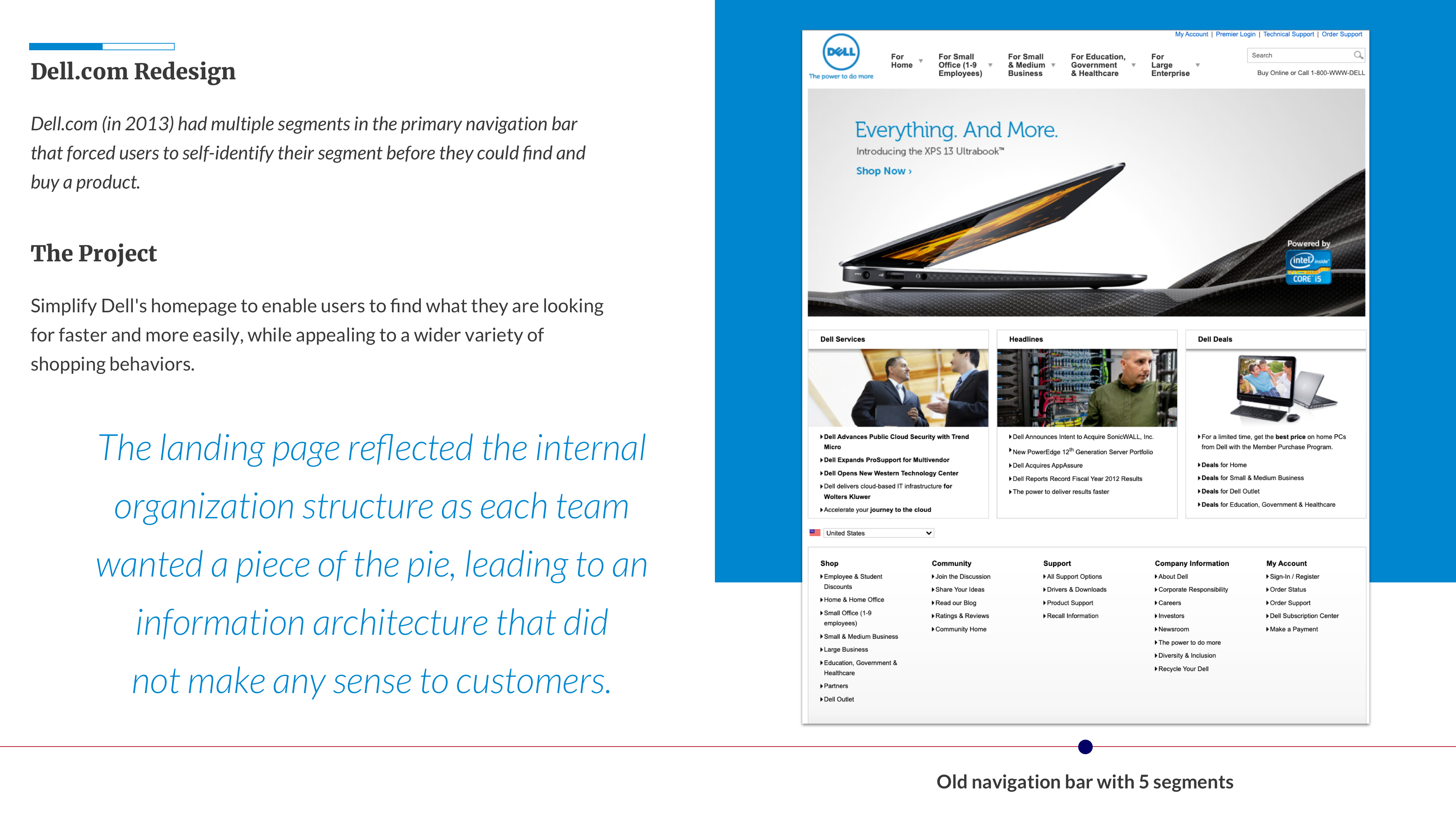
I'm an interaction designer and design developer.
My passion lies in the intersection of design, technology, and people. I have over 12 years of technology experience including UX design and web/software development.
I'm an interaction designer and design developer.
My passion lies in the intersection of design, technology, and people. I have over 12 years of technology experience including UX design and web/software development.
My story
Ever since my first computer-lab class in school, I have wanted to work in the field of computers and technology. I studied Computer Science for my undergraduate degree and started my career as a Software Engineer. A few years into life as a developer, I got the opportunity to work with user experience professionals. I was so excited and interested in what they did that I decided to go back to school. I spent two fantastic years at the University of Michigan learning more about design, user experience, and the fundamentals of human behavior. I have since worked at a UX design agency and an in-house UX team, and I am currently leading a design-driven development process at an education technology lab.
Things I like doing
UX & UI design
Product design
Web design & development
Mobile & responsive design
Solving problems
Leading design teams
Managing products
Sab is a seasoned engineer but he is foremost an experience designer. His work is always thoughtful, precise, and well-informed no matter the medium or device. I am constantly in awe of his ability to translate a list of requirements into a satisfyingly thorough and cohesive user flow. His deliberate design choices mean that for every “why” I have, he has a “because” to match! I feel listened to when I work with Sab; he genuinely cares about the user feedback I share with him and does what he can to make their experiences more enjoyable.
As a coworker, he is inspiring and encouraging, often proposing ideas or supporting others when they shoot for the moon. Sab is the most versatile UX designer I know, and I’m lucky I get to collaborate with him on the daily.
- Joann Agnitti, Product Manager at EdLab, Teachers College Columbia University (January 2018)
I very much enjoyed working with Sabarish because of his helpful guidance and always friendly attitude. He was the lead designer while we were working on redesigning Edlab's website. He always expressed himself clearly and eloquently about what he needed from me as his main visual designer. He would always suggest interesting visual solutions and reference important work. I always felt comfortable expressing my ideas to him and he would always suggest positive and constructive changes to make the work stronger. I would be happy to work with him again as I imagine anyone would.
- Isabella Cruz-Chong, Visual Designer, EdLab (April 2017)
Sabarish Raghupathy is a talented, energetic, creative thinker. I have had the distinct pleasure of working with him for the past two years at the EdLab and the Gottesman Libraries...Sabarish has earned the respect of his colleagues on the Software Development team and across the board at the EdLab, through his hard work, his strong collaboration and leadership skills, and his willingness to always go the extra mile to help others around him...
- Christopher Gu, Director, EdLab (Feb 2017)
I worked with Sabarish on multiple software design projects at Empirical, where he played an integral role on the team and contributed salient design recommendations and other deliverables (wireframes, high fidelity prototypes, etc.) that always exceeded client expectations...Aside from being really good at what he does, Sabarish is the kind of person everyone wants to have as a coworker. He is genial, reliable, helpful, knowledgeable about technology, humble, inclusive, and always optimistic. I'm privileged to have worked with him and glad to call him a peer. I cannot imagine anyone who wouldn't say the same.
- Amy Santee, UX Researcher, Empirical UX Design & Research (March 2015)
Sabarish and I worked together on several projects at Empirical and I feel 100% confident saying that he is one of the mythical UX unicorns we hear so much about, but never seem to find. He's got an eye for design, the skills to program, and an educated perspective that brings it all together to create elegant and successful user experiences. Add to that his genuinely good nature and sense of humor and you have one awesome colleague! In a nutshell, Sabarish is a true asset to any organization.
- Emily Bowman, Senior UX Designer, Empirical UX Design & Research (June 2014)
Sabarish was the UX intern for our group, Global Site Design. In that capacity, he was handed projects and assignments that seasoned UX architects feared and loathed. Sabarish handled all of it with good humor and with the professionalism of a seasoned veteran. He was easy to work with, always open to new ideas, and got the job done. What more could you ask for?
- Mary Lan, UX Design Lead, Dell Global Site Design (September 2012)
The Gottesman Libraries at Teachers College Columbia University is constantly evolving and headed to a future of seamless experiences for patrons. The new Library App and updated Library Website are two significant steps on this journey.
Update the existing website to enable patrons to easily access various library services and resources. Also update the various sub-systems and integrated systems.
As the lead user experience designer, I was responsible for the complete creative direction of the project, from conception and research to design and implementation.
The library successfully migrated to the new systems, including new -
➝ Initial Research and Interviews:
The new system should support self-directed learning.
There is too much going on throughout the site!
➝ Contextual Inquiry with Librarians:
Librarians would tell patrons to click the 1st column, 7th row, 2nd link, to get to the fine payment system!
Many patrons would just bring all their books in physically to renew them rather than use the online system. Most weren't even aware of the online system!
A unique aspect of the library is the acquisitions are largely patron-driven. We should highlight this in the new system.
➝ User & Task Models:
We are focusing on the following 3 broad types of users:
➝ Information Architecture:
An affinity wall of post-it notes was created to analyze all the pages. We purged several categories, re-classified others, and created new categories for all the pages.
➝ Interaction Design / Development:
The Gottesman Libraries at Teachers College Columbia University is constantly evolving and headed to a future of seamless experiences for patrons. The new Library App and updated Library Website are two significant steps on this journey.
Design a new app to enable patrons to easily access various library services and resources.
As the lead user experience designer, I was responsible for the complete creative direction of the project, from conception and research to design and implementation.
➝ Use Cases and User Flows:
➝ Information Architecture
➝ Interaction Design:
Making it easier for patrons to see items they have requested or checked-out, and take contextual actions is an important requirement.
Jaguar Land Rover's future technology research team's mission is to improve the user experience across a range of features within JLR automobiles, centered on the In-Vehicle Infotainment (IVI) system.
Rethink JLR's In-Vehicle Infotainment systems and explore future product concepts and usages in a highly interconnected, Internet-of-things, augmented reality world.
As a User Experience designer, I was responsible for -
Our team successfully delivered the scenarios, prototypes, findings, analysis, and recommendations for multiple use cases to JLR. The details of this project are under an NDA, so if you’d like to learn more, please ask offline.
➝ Ideation Sessions / Stakeholder Meetings:
➝ Project Requirements:
➝ IVI Use Cases / Concepts:
I was personally involved in the following use case concepts over the course of two years-
➝ Determining User Needs:
We spent time at the Portland International Raceway to meet and talk to drivers and experience the racing environment. We learned more about driver behavior, needs and desires, and usage of driving trackers/analyzers and cameras.
➝ Wireframing:
➝ Scenarios:
➝ Interactive HTML Prototypes:
➝ Testing:
Each user session consisted of a 1:1 interview in the vehicle. Users walked through the prototype scenarios and provide feedback on the design in terms of features, functionality, usability, and overall appeal of the concepts.
The Intel® IoT Platform is an end-to-end reference model and family of products from Intel, that works with third-party solutions to provide a foundation for seamlessly and securely connecting devices, delivering trusted data to the cloud, and delivering value through analytics.
Collaborate with Intel's IoT UX team and Intel Labs to explore future product concepts and usages surrounding Internet of Things in three broad categories - In-Vehicle-Infotainment Systems, IoT Kits, and Intel Technology Access.
As a User Experience designer, I was responsible for developing use cases, wireframes, and developing experiences around Intel's Internet of Things technology.
We successfully delivered the scenarios, prototypes, findings, analysis, and recommendations for multiple use cases to Intel.
➝ Project Requirements:
Design an IVI system with smartphone integration for Intel Labs’ Orion IoT project.
The final deliverable should be a comprehensive, working, demo-able product for the CES show in Las Vegas.
➝ Scenarios:
Several scenarios were developed surrounding smartphone integration with the IVI system, such as:
➝ Interactive Prototype Demo:
Detailed wireframes and their visuals were then designed.
Finally, we developed an interactive prototype that featured integration between the IVI system, location sensors, steering wheel, different IVI apps, and up to four mobile phones.
➝ Project Requirements:
Design and develop software that shows users how to use the Intel IoT kits through a beginner demo interface and through different use case walkthroughs.
Each IoT use case concept needed to be completely detailed out, with user models, task models, interaction and visual design specifications, and fully functional prototypes/working programs.
➝ Interactive Web Apps:
Example use case - IoT integration with a delivery truck, to monitor temperature, vibration, location, door open/close status, etc.
➝ Project Requirements:
Define experiences around Intel Technology Access, which lets devices connect and communicate with other devices and share resources.
➝ Wireframing:
Rhizr is a collection of learning opportunities linked together to support serendipitous discovery. Use it to create, organize, reuse, and remix content.
Design a new learning and organization interface.
Rhizomatic learning is a way of thinking about learning based on ideas described by Gilles Deleuze and Felix Guattari. A rhizome is a stem of a plant that sends out roots and shoots as it spreads. Similarly, in Rhizomatic learning, ideas are multiple, interconnected and self-replicating.
This was one of my first projects at EdLab. As a user experience designer, I used this opportunity to introduce various UX methods to the team. Then as a user interface developer, I also helped develop this project. I worked with a project manager and two developers on this project.
➝ Dissect 'mSchool':
➝ Brainstorming / Design thinking:
Rhizr strives to create "a learning environment in which the student can learn to restructure the new information and their prior knowledge into new knowledge about the content and to practice using it" - Dean A. McManus
➝ Determining User Needs / Task Flows:
➝ Information Architecture / Interaction Design:
➝ Bootstrap Framework + Meteor JavaScript:
➝ Testing:
The metaphorical structure of the website i.e the concept of Rhizrs, Roots, and Nodes is not very understandable to users.
The ideas around 'curating' and 'remixing' are not very clear to users and the functionality is also not very intuitive.
"Vialogues", deriving from video + dialogues, is a community of learners using video to ignite discussion.
Redesign and enhance Vialogues with a focus on self-directed learning. With thousands of users around the world still using its first incarnation (launched in 2010), there has been a desperate need for an upgrade and constant demand for additional features and an easier to use interface.
I was the lead designer on this project and was responsible for its complete creative execution. I worked closely with a UX researcher for the initial analysis and later testing parts, and with a visual designer to create the high-fidelity designs.
➝ Determining Areas of Improvement:
Through multiple stakeholder meetings, ideation/brainstorming sessions, and review of site feedback data, we decided that the following areas needed improvement:
How do we help create the rich, active discussions we set out to support and provide users the sense of community they feel across similar discussion sites?
How can we improve our polling and question feature to better serve learners?
How can we improve discoverability of people and content?
➝ Determining Project Scope:
For our first phase, we will be focusing on general UI updates and improve the search & recommendations system.
➝ Evaluation of old website:
How do I change the closed-captions?
How will I know if my students watched the video?
I’ve always wondered how the recommended Vialogues are determined? I feel like some SiNY or Voice episodes always have the same suggestions!
➝ Interaction Design:
EdLab is a research, design, and development unit at Teachers College, Columbia University working on the future of education technology, but they had a website that was stuck in the early 2000s.
Design a new website for EdLab highlighting EdLab's network of apps by enabling users to easily interact with the enormous amount of content that users create using these apps.
I was the lead designer on this project and was responsible for its complete creative execution. I worked closely with a UX researcher for the initial analysis and later testing parts, and supervised a visual designer to create the high-fidelity designs. I then worked closely with the developers during the implementation stage, including help polish some functionality and styles by diving into the code.
➝ Project scope and requirements:
➝ Evaluation of old website:
Since the old EdLab website had a different account system compared to other EdLab apps, confused users created EdLab 'website accounts' instead of an EdLab 'apps account'.
➝ Interviews / Design events:
The larger Teachers College community members didn't know much about EdLab.
➝ Information Architecture / Interaction Design:
➝ High Fidelity Designs / Pixel Perfection:
➝ Prototyping:
Users feel the new design does a good job of informing them of what EdLab does and can do. They like seeing our latest posts and events.
Simplify Dell's homepage by restructuring the confusing main navigation and decluttering the landing page to enhance the shopping experience for visitors to the site.
Dell.com (in 2013) had multiple segments that forced users to self-identify their segment before they could find and buy a product. I helped simplify the product browsing and shopping experience for the millions of (monthly) visitors on dell.com, by reducing the segments on Dell's main homepage from five to two ('For Home' and 'For Work').
Users felt the home page was cluttered and struggled to find the correct place to start engaging with the navigation.
I worked closely with other experienced UX designers and researchers on this project. I contributed to the ideation sessions, wireframing, creating the hi-fidelity interactive prototypes in Axure, and finally consolidating the remote test results (conducted on usertesting.com).
➝ Evaluate existing homepage:
The landing page reflected the internal organization structure as each team wanted a piece of the pie, leading to an information architecture that did not make any sense to customers.
➝ Information Architecture:
We brainstormed multiple approaches to improve the IA, including -
➝ Testing:
➝ Results and Learnings:
Users felt the home page was cluttered and struggled to find the correct place to start engaging with the navigation.
This was implemented in March 2013. Read Dell's blog post for more details.
Note: The Dell homepage has since been updated to Option 1 (only 'Products') for US and European visitors. It remains in Option 2 ('For Home', 'For Work') for some International markets.
The Analytical Product Design course at The University of Michigan requires students to work in teams to apply multidisciplinary (engineering design, product design, human-centered design, and product-directed entrepreneurship) methods on a project. We redesigned the standard power outlet.
Redesign the standard power outlet considering advancements in technology, increased user demand, and new user requirements.
Our team was a multi-disciplinary team, consisting of a mechanical engineer (Cole), an electrical engineer (Karthik), a business major (Dan), and a user experience designer (me). As the user experience lead, I was actively involved in the research and design phases.
We designed an award-winning outlet, with multiple sockets, USB charging ports, and an extension cord -- all built into a standard size gang-box with an unobtrusive design.
➝ Research:
➝ Design:
➝ Prototypes and Testing:
➝ Final Design:
The 'Evolve Outlet' had the following features-
A 3D print version of the evolve outlet was displayed at the Design Expo at The University of Michigan and won the Best Project Award! The project was also displayed at UMSI's "expoSItion '13" and got an honorable mention under the overall best project category.
Wireframes, Mockups, User Models, and Work Samples from multiple projects.
Interactive environment to explore, discover, and learn about. Shown above is the interaction of clicking on a fish and getting contextual actions and information.
A software application to view, add and manage the complex taxonomy in healthcare.
A POC to create a new application for PayPal in the Indian market.
Complete redesign of Symantec's Support portal website.
Responsive File Upload and Pagination patterns for use on Dell.com
The UI/UX design and development teams at Dell were using personas created by the Marketing division, that were too general.
The Global Site Design team was tasked with creating new personas and to understand our customers by mapping the end-to-end user journey with a product from research to purchase and beyond.
As a UX Architect intern, this was one of the projects I got to work on on the research side. I worked closely with another UX Architect and a UX Lead.
I helped lay the groundwork for the initial interviews, research and analysis that lead to the creation of journey maps and eventually new personas.
➝ Determining User Needs / Interviews:
➝ Interview Analysis:
➝ Next steps:
The project was a longer-term project than my internship duration and continued beyond it through more phases towards the generation of new personas.